
Researchers convert seismic data into sounds and animations, providing scientists with a new way to view what happens to Earth during earthquakes.
imagery
Posted inNews
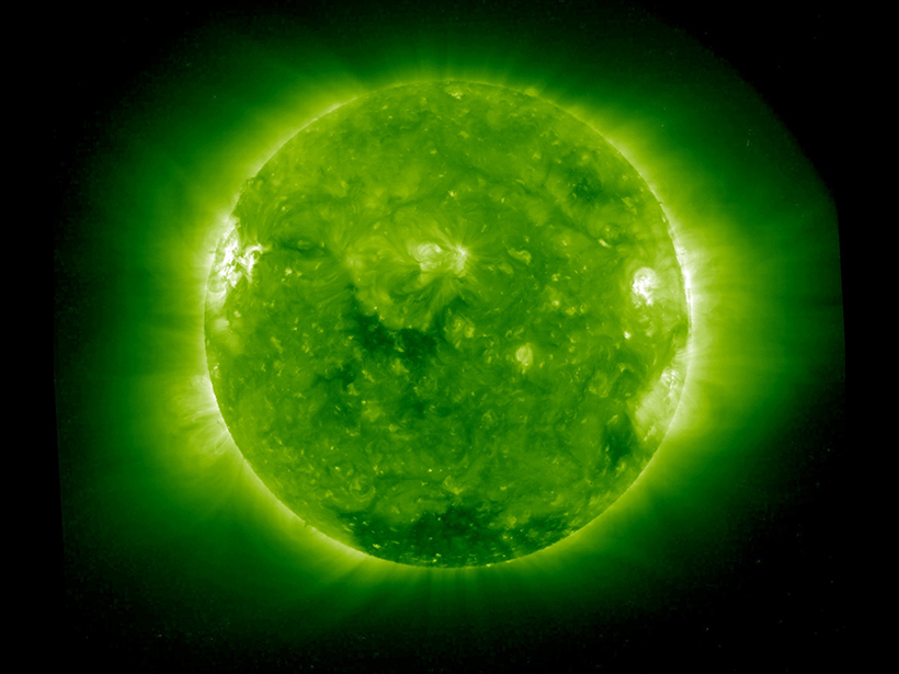
Scientists Get First Glimpse of Solar Wind as It Forms
Using computer-processed images from Sun-watching satellites, scientists observed solar wind emerging from the Sun's corona.

Posted inFeatures
New Insights into North America’s Midcontinent Rift
The Midcontinent Rift has characteristics of a large igneous province, causing geologists to rethink some long-standing assumptions about how this giant feature formed.

Posted inResearch Spotlights
Novel Technique Finds New Features Under United States
A new high-fidelity tomography harnesses USArray data to expose a wealth of noteworthy crustal and upper mantle structures, including previously unknown anomalies beneath the Appalachians.

Posted inResearch Spotlights
Seismic Clues Reveal the Mechanisms Behind Iceberg Calving
Scientists combine models and video footage of iceberg calving to analyze the potential of seismology to unravel physical processes behind the breakup of ice sheets.

Posted inNews
Experiment Captures First Image of Thunder
Scientists can now visually capture the sound waves created by thunder, a technique that could lead to an increased understanding of how lightning forms and transmits energy.

Posted inFeatures
The Art and Science of Hubble's Images
How do Hubble images get their vivid colors and subtle shading?
Posted inResearch Spotlights
Seismic Wave Modeling Goes Local
A new technique brings accurate models of traveling seismic waves to a regional scale.
Posted inOpinions
Reply [to "Comment on 'Color Schemes for Improved Data Graphics,' by A. Light and P. J. Bartlein"]
By calling attention to the perception of data graphics among color-impaired readers, we hoped to raise awareness of an even more prevalent phenomenon: the misuse of spectral, or “rainbow,” color schemes. David B. Stephenson is quite right regarding the incidence of different forms of color-vision impairment, which varies among racial and ethnic groups and is […]
Posted inOpinions
Comment on "Color Schemes for Improved Data Graphics," by A. Light and P. J. Bartlein
As a color-blind climatologist, I very much appreciated the important color-awareness issues raised by A. Light and P. J. Bartlein in their recent Eos article titled “The End of the Rainbow? Color Schemes for Improved Data Graphics,” (85(40), 5 October 2004, p. 385). Meteorological and climate information is frequently communicated in the form of highly […]