Data visualization and mapping are valuable tools in the fight against COVID-19. Geoscientists can help healthcare workers and shape public policy.
data visualization
Posted inOpinions
Transcending Science: Can Artists Help Scientists Save the World?
The artistic process begins with human engagement. Perhaps the revolution we need to address climate change begins by making it an integral part of the scientific method.
Posted inAGU News
AGU’s Virtual Poster Showcase Gives Students a Leg Up
Offering alternative means of participating in research sharing means that students with disadvantages don’t have to lose important career experiences.

Posted inNews
Many Water Cycle Diagrams Promote Misconceptions
Most representations of the water cycle are flawed, researchers found by analyzing over 450 diagrams: The effects of humans, seasonal changes, and different biomes are often neglected.

Posted inScience Updates
Giovanni: The Bridge Between Data and Science
Using satellite remote sensing data sets can be a daunting task. Giovanni, a Web-based tool, facilitates access, visualization, and exploration for many of NASA’s Earth science data sets.
Posted inScience Updates
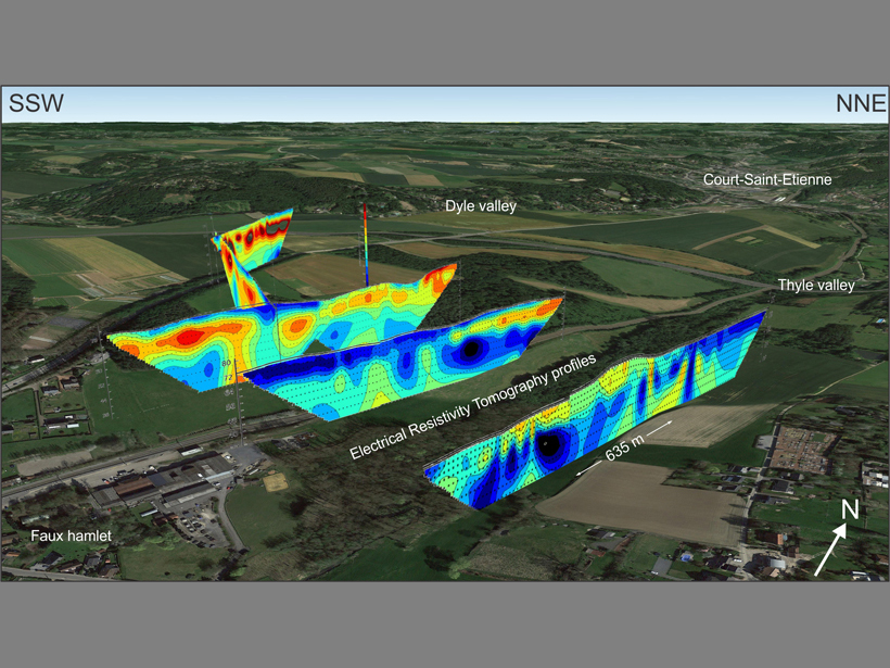
Visualizing Cross-Sectional Data in a Real-World Context
Combining the capabilities of an open-source drawing tool with Google Earth maps allows researchers to visualize real-world cross-sectional data in three dimensions.
Posted inScience Updates
Visualizing the Climate’s Future
Climate Inspector: A new Web-based approach to exploring global climate change across space and time.
Posted inScience Updates
Visualization and Analysis Tools for Ultrascale Climate Data
The Ultrascale Visualization Climate Data Analysis Tools (UV-CDAT) software project enables climate researchers to solve current and emerging data analysis and visualization challenges.
Posted inOpinions
Reply [to "Comment on 'Color Schemes for Improved Data Graphics,' by A. Light and P. J. Bartlein"]
By calling attention to the perception of data graphics among color-impaired readers, we hoped to raise awareness of an even more prevalent phenomenon: the misuse of spectral, or “rainbow,” color schemes. David B. Stephenson is quite right regarding the incidence of different forms of color-vision impairment, which varies among racial and ethnic groups and is […]
Posted inOpinions
Comment on "Color Schemes for Improved Data Graphics," by A. Light and P. J. Bartlein
As a color-blind climatologist, I very much appreciated the important color-awareness issues raised by A. Light and P. J. Bartlein in their recent Eos article titled “The End of the Rainbow? Color Schemes for Improved Data Graphics,” (85(40), 5 October 2004, p. 385). Meteorological and climate information is frequently communicated in the form of highly […]