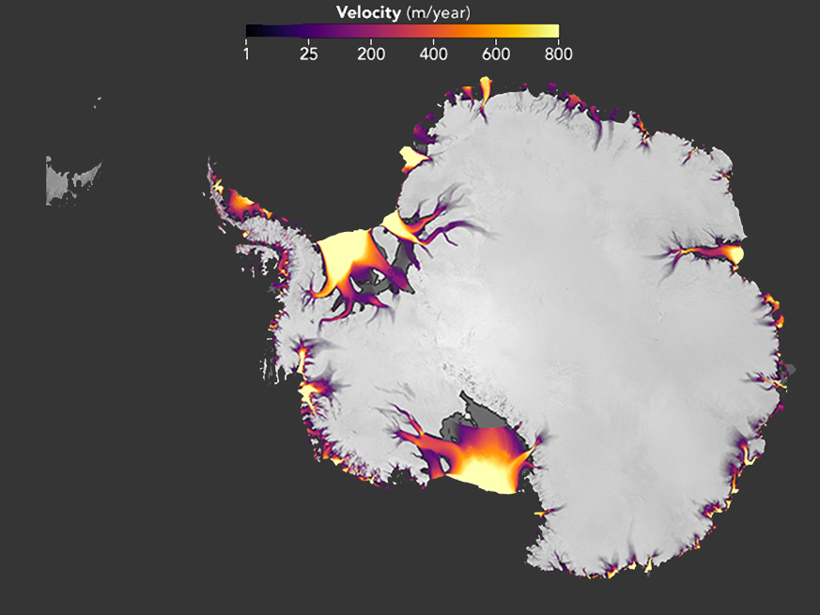
From bold purple to brilliant yellow-orange bursts, the map above pinpoints regions along coastal Antarctica that have recently experienced moderate to severe ice loss. The map’s surface ice velocities, measured in meters per year, come from Landsat 7 and 8 data averaged over 2013–2015.
As this map shows, ice loss in western Antarctica is faster and more extensive than in the east, particularly in the Ronne (upper) and Ross (lower) ice shelves. The data underlying this map that depicts recent Antarctic ice flow are from a 13 February study published in The Cryosphere. However, the map doesn’t appear in the paper; the researchers created it for an article posted online by NASA about the new research.
Not only is ice loss in western Antarctica already much higher than on eastern shores, but it’s also accelerating, according to the research team behind the map and paper. By comparing the most recently available Landsat data with earlier estimates of ice velocity from 2008, the team could determine where ice loss has sped up or remained steady across nearly the entire Antarctic Ice Sheet.
The researchers’ comprehensive look revealed that the greatest acceleration of ice loss from 2008 to 2015 took place among glaciers that feed Marguerite Bay on the western Antarctic Peninsula, in an area too small to see on the large map above.
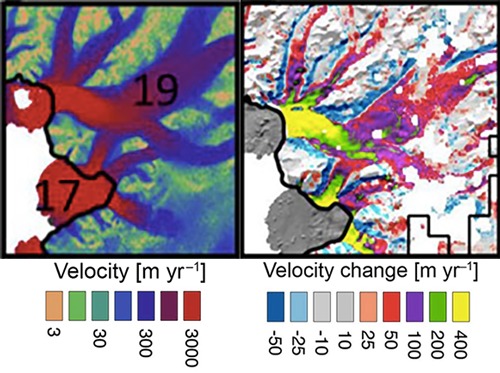
As seen in another map below that zooms in on the Marguerite Bay area, the speed of ice loss there increased from about 2,600 to 3,000 meters per year in some locations. That’s a jump of roughly 400 meters per year (15%).
Using the newest Landsat data each time, “we can map ice flow over nearly the entire continent, every year,” Alex Gardner, lead author on the paper, said in the NASA article. Gardner, who is a research scientist at the Jet Propulsion Laboratory in Pasadena, Calif., added that “with these new data, we can begin to unravel the mechanisms by which the ice flow is speeding up or slowing down in response to changing environmental conditions.”
—Kimberly M. S. Cartier (@AstroKimCartier), News Writing and Production Intern
Citation:
Cartier, K. M. S. (2018), New maps highlight Antarctica’s flowing ice, Eos, 99, https://doi.org/10.1029/2018EO094613. Published on 12 March 2018.
Text © 2018. The authors. CC BY-NC-ND 3.0
Except where otherwise noted, images are subject to copyright. Any reuse without express permission from the copyright owner is prohibited.