Cee Nell entered graduate school to study tropical birds but emerged entranced by the power of data visualizations. The catalyst was a programming language called R that’s used to help parse and visualize large, complex data sets.
R’s ability to manage different sources of data and spatial layers and return a compelling graphical representation of what were once just numbers “felt like this very powerful thing to me,” Nell said.
While taking data science courses as a Ph.D. student at the University of California, Irvine, Nell used R to make interactive web apps for community groups.
“We see ourselves as this visual graphics reporting team, or data journalists, for water science and water data.”
The work reinforced for Nell the transformative power of data visualizations. “That was everything for me. I loved it so much,” they said.
Now, as the leader of the U.S. Geological Survey’s water data visualization team, Nell works with a group of programmers and data scientists to turn data on U.S. waters into beautiful, insightful graphics that communicate complex topics to the public. Collectively, the team has expertise in programming, hydrology, ecology, cartography, illustration, graphic design, and science communication.
“We see ourselves as this visual graphics reporting team, or data journalists, for water science and water data,” Nell said.
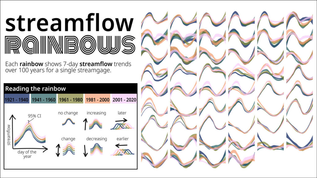
Nell’s portfolio includes a century of hydrological data from streams around the country imagined as a series of rainbowlike curves and a nationwide map showing streamflow changes over the course of a month. In both projects, Nell turned massive data sets into something that can be digested in a few seconds.
Nell often starts a project by simply plotting every data point and stepping back to see what stands out. Playing with color and layout can help them tease out patterns, and a good visualization proceeds from there, they said.
“There’s this huge need for data visualization at all levels.”
With its balance of coding and artistic interpretation, a data visualization role may seem like an intimidating mash-up. But the job of making creative, informative representations is more accessible than many imagine, Nell said. And with more data available than ever before, it’s a valuable skill.
Today tools such as Excel and Tableau allow even those who don’t know R or JavaScript to translate complex data sets into meaningful visualizations.
“There’s this huge need for data visualization at all levels,” they said. “You don’t need to be this really advanced programmer.”
—Nathaniel Scharping (@nathanielscharp), Science Writer
This profile is part of a special series in our August 2023 issue on science careers.