“Preserve and cherish the pale blue dot, the only home we’ve ever known.”
data visualization


Posted inEditors' Vox
Foundations in Data Analysis for Undergraduate STEM Students
A new textbook serves as an initial course in scientific data analysis and hypothesis testing designed for students in all science, technology, engineering, and mathematics disciplines.

Posted inOpinions
How to Address Publication Overload in Environmental Science
Combining traditional human-curated syntheses of scientific research with the search and visualization tools of artificial intelligence could guide researchers through avalanches of publications.
Posted inNews
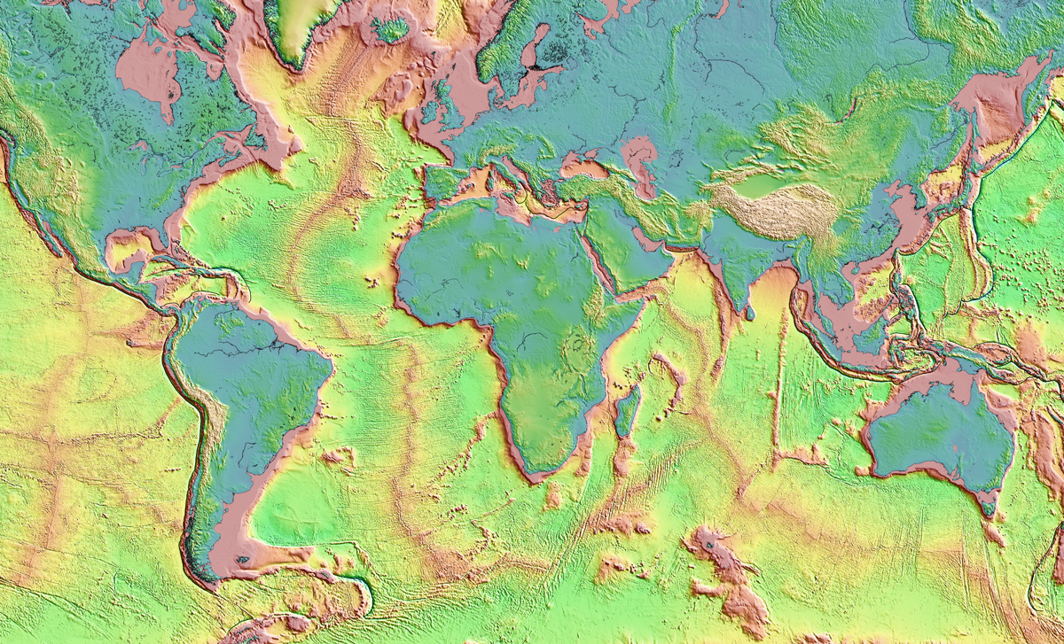
A New, Underground Atlas of Subduction Zones
Submap merges graphic design with geodynamics, providing a fast, free, and user-friendly resource to map subduction zones.

Posted inFeatures
Cee Nell: Making Data Visual
Nell turns vast columns of data into beautiful and understandable graphics.

Posted inScience Updates
Comunicación de la ciencia que va más allá de las palabras
Estudiantes de posgrado en ciencias de la Tierra y estudiantes de ilustración científica de licenciatura se unieron para crear visualizaciones accesibles y atractivas de la investigación que trascienden las limitaciones del uso exclusivo del lenguaje.
Posted inScience Updates
Earth Is Noisy. Why Should Its Data Be Silent?
Combining visual and sonic representations of data can make science more accessible and help reveal subtle details. The recent decade-long eruption of Hawaii’s Kīlauea Volcano offers a prime example.

Posted inScience Updates
Science Communication That Goes Beyond Words
Earth science graduate students and scientific illustration undergraduates teamed up to create accessible, engaging visualizations of research that transcend limitations of using language alone.
Posted inFeatures
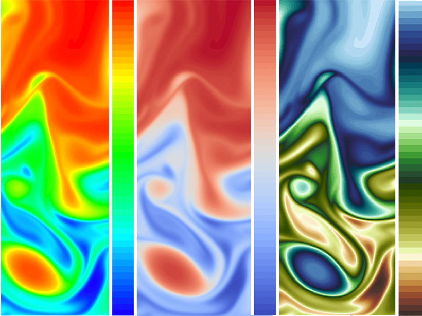
Visualizing Science: How Color Determines What We See
Color plays a major role in the analysis and communication of scientific information. New tools are helping to improve how color can be applied more accurately and effectively to data.