
The uplift, several centimeters in magnitude, is likely caused by water pooling in the mountain’s shallow aquifers. The effect is shorter lived than deformation caused by magmatic activity.
GPS & GIS
Posted inResearch Spotlights
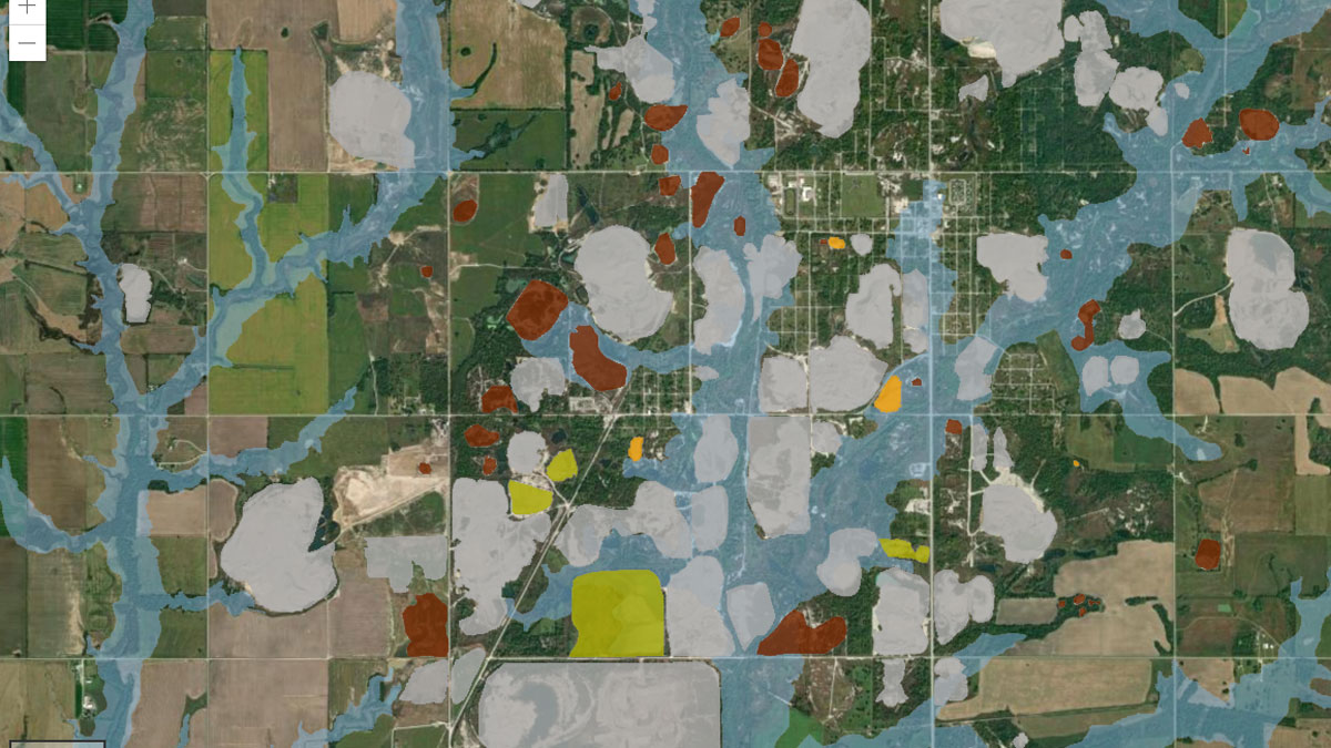
Making a Map to Make a Difference
A new study highlights the partnership between scientists and nonscientist community members in building an interactive GIS map to show flooding risk in a Superfund site.

Posted inResearch Spotlights
Nudging Earth’s Ionosphere Helps Us Learn More About It
New observations and simulations capture the physics at play across each of the three main ionospheric regions.
Posted inEditors' Highlights
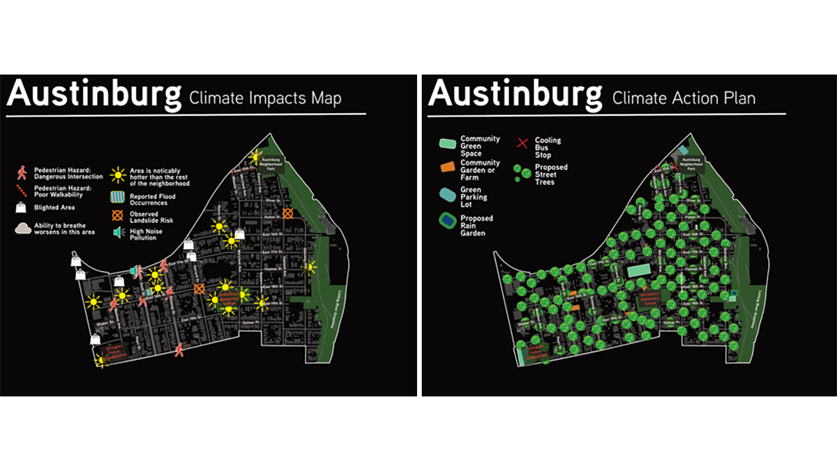
Resilient Solutions Involve Input and Data from the Community
Data dashboards assist in understanding a community’s vulnerability to climate impacts, but input from the communities themselves helps identify and support actionable solutions.

Posted inEditors' Highlights
Wave-Modulated Electron Loss Affects GPS Location Determination
Earth’s magnetosphere controls ionospheric total electron content modulation via plasma wave-induced electron loss impacting GPS spatial location determination.

Posted inResearch Spotlights
Helping the Most Vulnerable Stay Cool in Extreme Heat
Choosing the ideal location for air-conditioned cooling centers in cities facing dangerously high temperatures takes good population data and community engagement.
Posted inNews
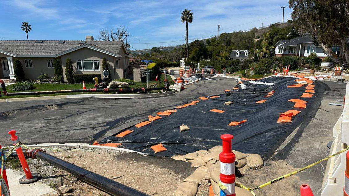
Rancho Palos Verdes Landslides Have Residents Seeking Science
Residents of Rancho Palos Verdes are looking to the scientific community for help in understanding the slow-moving landslides that are destroying their community.
Posted inNews
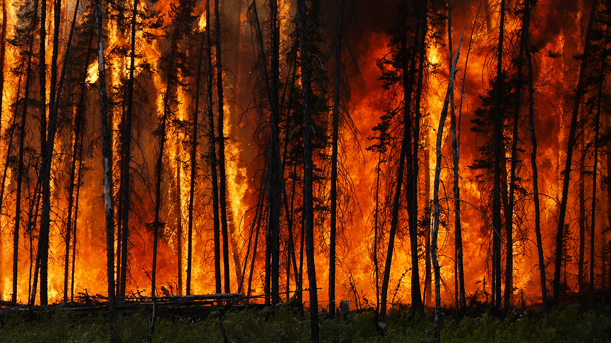
Extreme Wildfires Are Getting More Extreme and Occurring More Often
The world’s most energetic wildfires have doubled in intensity and number over the past 2 decades, with climate change and land management likely to blame.
Posted inNews
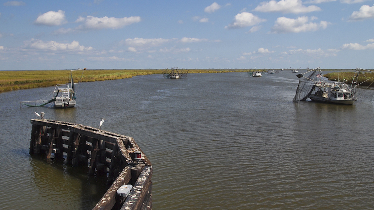
Mapping Sinking Land for Tribal Resilience in Louisiana
The Grand Caillou/Dulac Band of Biloxi Chitimacha Choctaw Tribe has been losing land to the sea, which could hamper efforts to gain federal recognition.

Posted inNews
Maps Strengthen Collaboration Between Tribes and Federal Agencies
As U.S. agencies commit to better incorporating Indigenous viewpoints, maps could be one important tool.